Guiding new investors to make informed choices

This was a project conducted in 2022 whilst I was a Lead Experience Strategy Consultant at Nomensa. The work from this project was handed over to Hargreaves Lansdown in December, and went live throughout 2023.
My involvement was to lead a team of Content writers, UX researchers, UI designers and Accessibility consultants. And as the Experience Director I was responsible for the successful delivery of the project, ensuring that the outputs met the client's needs, provided an excellent user experience and is delivered within the budget and timeframe for the project.
Hargreaves Lansdown (HL) is the largest investment platform in the UK. A British financial services company offering funds, shares, savings products to retail investors.
Typically HL target older customers with more wealth to manage. These customers were more inclined to expect a traditional, managed investment experience.HL wanted to establish a larger market share with younger / first-time investors. However, they weren’t typically successful with this user-group and didn’t know much about them.
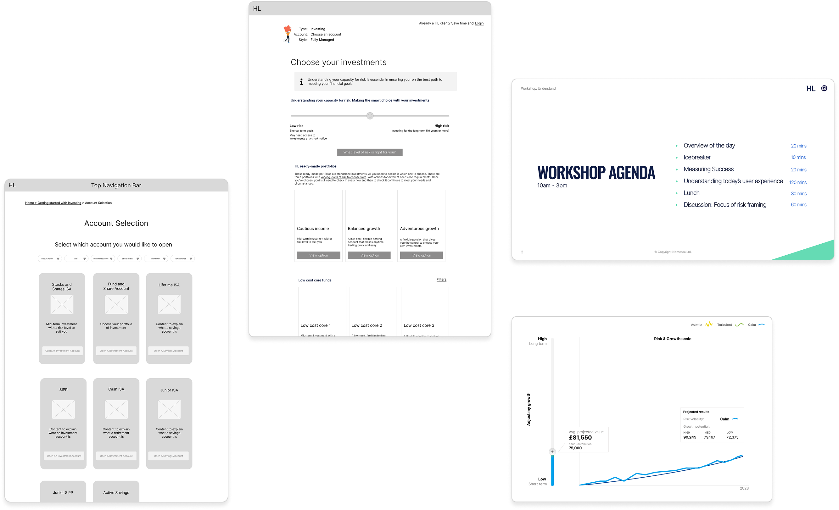
They were looking to launch a new set of “Ready-made Investments”. Which they understand would provide a competitive offering where others in the market were standing out, such as Nutmeg and Wealthify.
They asked us to design the new customer experience, built on a foundation of knowledge we would uncover on the user-group - including the onboarding and consideration phases through to account creation.
Younger investors often have specific needs that a traditional financial products fail to meet. A significant challenge was uncovering their motivations, needs, pain-points, and existing perceptions about investing. This required moving beyond surface-level insights to truly understand their financial literacy levels, risk tolerance and aspirations.
Whilst younger investors might desire simplicity, an investment product also needs to offer sufficient functionality and comprehension to comply with the FCA. A challenge was striking the balance between a minimalist, easy-to-use interface and providing all the necessary tools and information for users to make informed decisions.This meant we had to prioritise essential features and strategically revealing more advanced options as users became more comfortable.
For any investment product, trust is paramount. For a potentially wary & sceptical audience, establishing creditability was a major hurdle. The design of the journeys had to instil confidence in their investment choices and with all the decisions they had made in setting up their account. This included translating complex financial language into easily digestible and understandable information. This involved thoughtful progressive disclosure of information, clear communication and a ‘jargon-busting’ approach. Whilst in keeping with a sense of professionalism that is expected from a firm like HL.
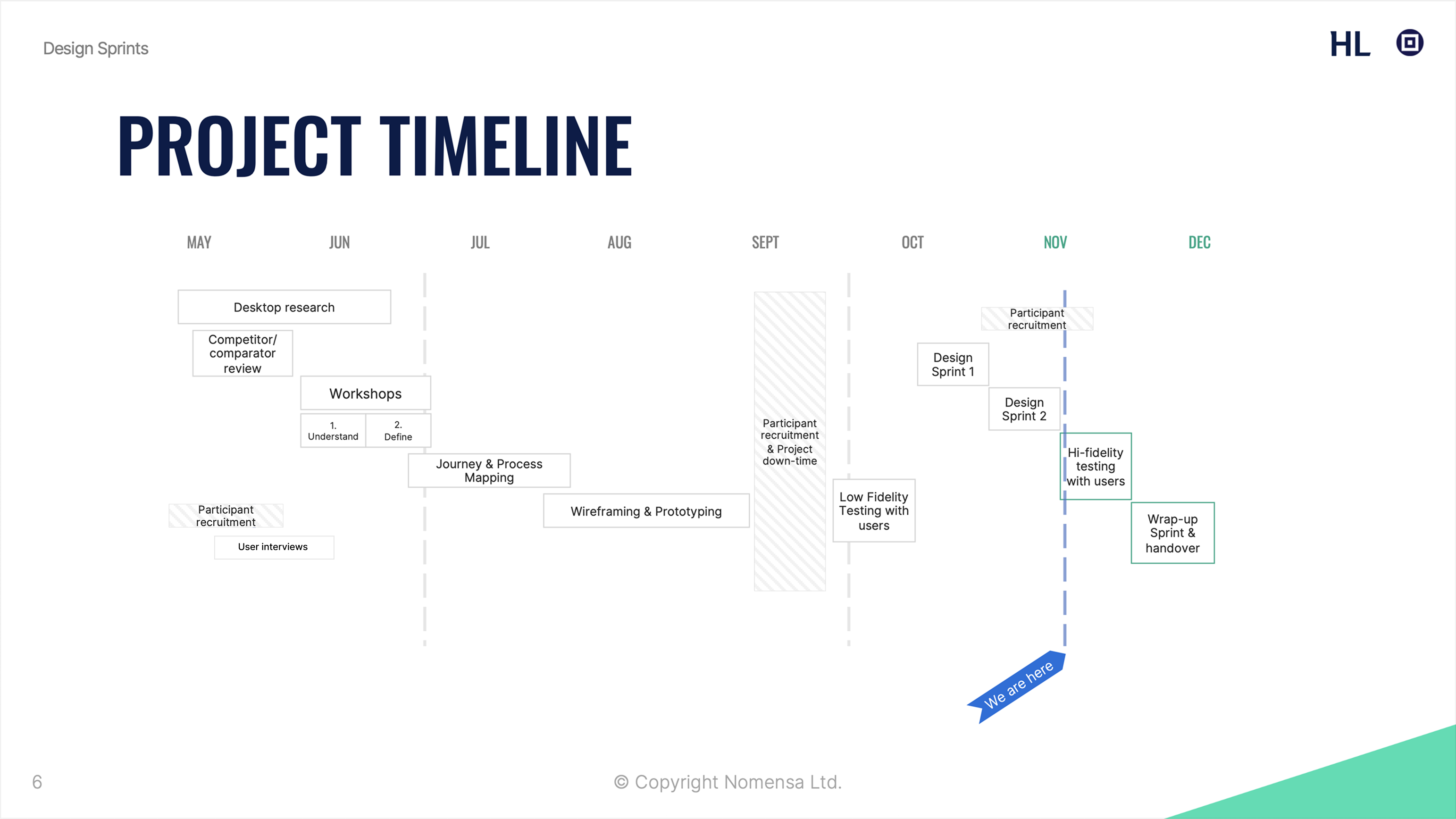
From these we defined the problems to solve & understood how to work within their internal processes to get it done.
The aim of this round of testing was three-fold:
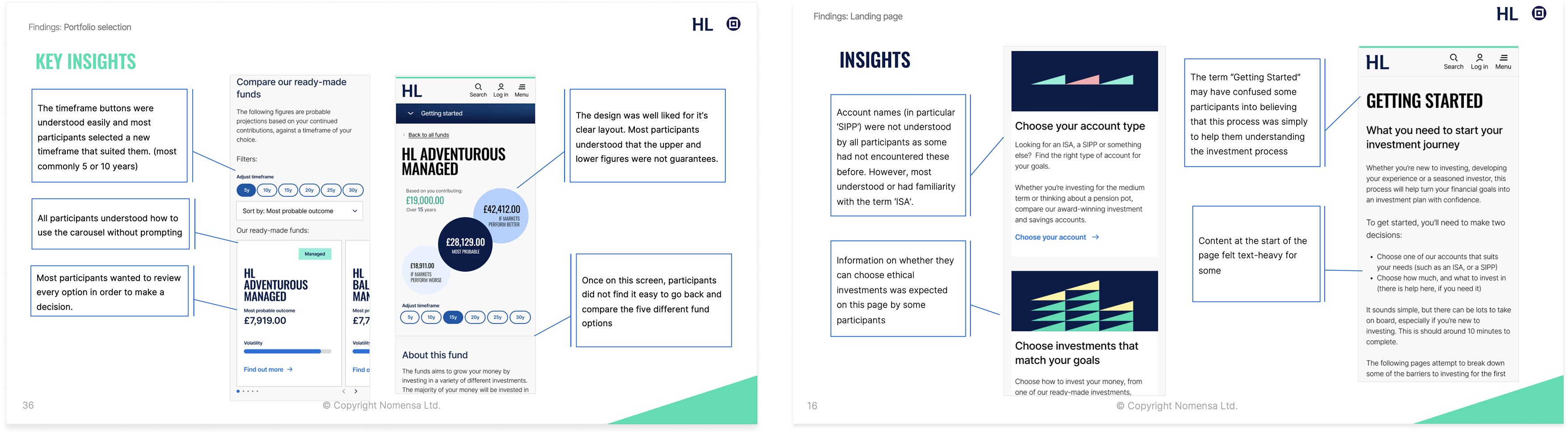
The journey boosted users' understanding and confidence throughout the process, and users felt confident at key decision points. There is scope, however, for increasing confidence through providing more information on concepts that are new to first-time or new investors. UX and UI improvements at the fund selection stage will further improve confidence. 9 out of 12 participants decided to purchase a Ready-Made Investment, suggesting that the journey works well to signpost the RMIs to clients that would benefit from this approach. HL should consider how to present ethical investing options to clients who might be interested in an RMI product, as the lack of signposting on this meant that some participants would look elsewhere.
